
Once you are bringing increasing amounts of traffic to your e-commerce website, you are ready for the next big task – selling your products. You have brightly colored product pages with pretty good descriptions. And viewers can click a link for even more information.
Here’s the thing: That visitor is on your site because something has brought him there. He may have done a search for your type of product; he may have seen one of your social media posts; he may have clicked on an ad you created. If he is serious about purchasing such a product, then he should reasonably click the “purchase” button once he has seen it and read your description.
WHEN THINGS AREN’T GOING AS YOU EXPECTED
But what if those visitors are not making purchases at a solid rate? The average conversion rate is 2.35% once visitors land on a product page. If you are not achieving that, or your conversion rate is stagnant around that percent, then it’s time for a closer look at your product page.
Something is turning your visitors off, even though they obviously have an interest. And if it is your product page, then there are some things you can do to spark it up. Here are seven of them.
1) YOUR CTA MUST STAND OUT
The goal is to tell the customer what to do next and to make it clear, simple, and easy. Here are some things to think about as you design those CTA buttons:
- Do not confuse the customer with other CTAs close by. You may confuse them, and you only want them to do one thing – make the purchase
- The words on your button should be clear and simple. “Buy Now” is still a great button text.
- If you have multiple products, you may want to use “Add to Cart,” and then make it easy for the customer to “continue shopping.” But if you only sell a few products, you might want to re-think the “add to cart” button. One of the biggest complaints of e-commerce retailers is abandoned carts. Clicking “buy now” begins the actual purchasing process
- Make sure the button color stands out from other surrounding text or images.
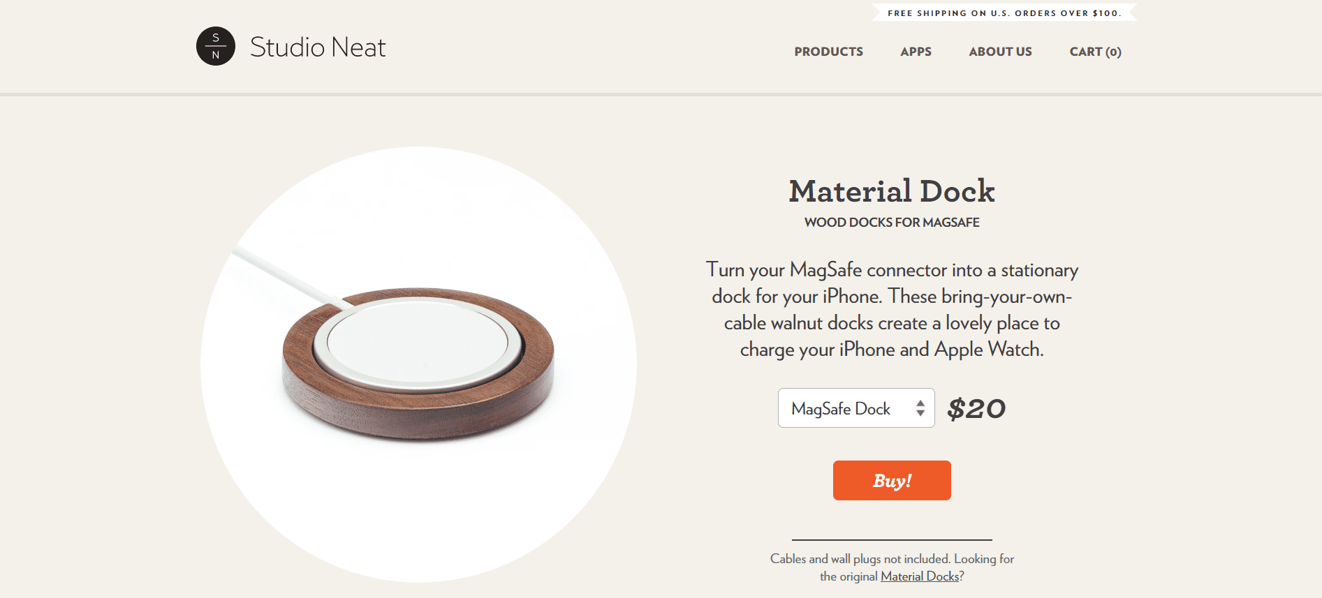
Studio Neat sells docking stations, among a number of other products. Here is a sample of one item on its product page. Note the orange buy button – can’t miss it.
2) YOUR PRODUCT DESCRIPTIONS MATTER
While we all know that visuals trump text when appealing to customers, this doesn’t mean that product descriptions are not important. They can be critical. Here are things to consider:
- Keep them relatively short. No one wants to read a wall of text. If you have specifications or longer explanations, provide a link to get to those.
- Be a bit creative and stay true to your brand “voice.” You know your audience, so give it what it really wants to know
- Speaking of the audience, your language tone and style must match. You would not write the same description of a Cartier bracelet as you would a Lego toy for kids.
If you aren’t the creative description-writing type, then check out some writing services websites that have creative writing departments.
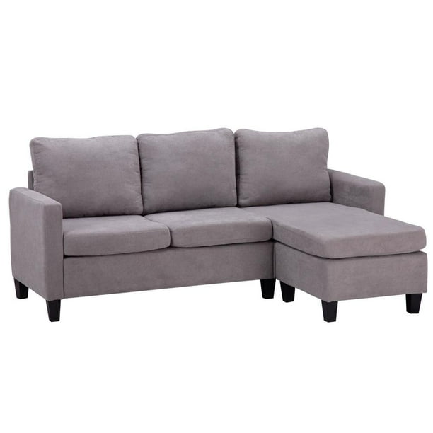
3) USE A PROFESSIONAL FOR YOUR PHOTOGRAPHY
You only get one chance to impress. And it’s not as if your customer can actually touch the product as he can in a brick-and-mortar store. While this may cost a bit, it is worth it. A professional will have creative ideas for displays.
Consider a picture of a couch all by itself on a bland background. Now think about the difference when that couch is placed in a living room amidst other furnishings and wall art. The difference is startling.
 Walmart.com
 Wayfair.com
When products are placed in the actual environment of use, the customer can “see” that product in his own environment too. Clothing should be on actual people; smartphones should be in people’s hands. Let a professional design the display.
4) INCLUDE SOCIAL PROOF
One of the most compelling incentives for product purchasing is the recommendations of happy customers. And these should be a part of your product page. The dilemma is where to put them.
One option, of course, is to provide a link to them, as some of the large enterprises do – Amazon, Home Depot, etc. People who have an interest in an item from one of these “big boys” will probably click over to the reviews.
But you have another option also used by those “big boys.” Publish a star rating in full view of the customer:
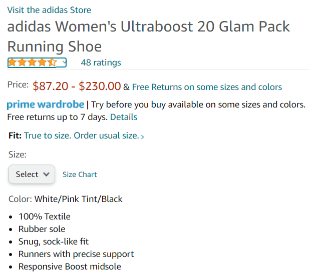 Amazon.com
And if each of your products has its own page, you can actually publish some of those reviews below the fold. Putting them up close to the description and CTA will be distracting.
Still another option is to have a video of a happy customer using your product. It won’t be professional, but it will be compelling.
5) SPEAKING OF VIDEOS
This is a great way for your customer to get a full understanding of your product’s value. It can be a customer-submitted one, or, if you want something more professional, have one produced.
The goal is to have a customer see your product in action and see himself using that product just as it is in the video.
Consumers like videos. They say what a short product description cannot, and they are definitely watched. In fact, 90% of surveyed consumers state that videos are important when they are considering a product purchase.
And while you’re at it, consider using some of the newer technology that your competitors might already be using – augmented and virtual reality experiences. While these may not be “right” for many products, they might be for yours.
Eyewear companies allow trying on glasses frames virtually from home; clothing retailers do the same; resorts provide virtual tours’ wine companies give virtual tours of their vineyards and processing.
Liingo Eyewear lets customers use their webcams or a selfie and then try on a series of frames from all angles.

6) EXPLAIN YOUR PRICING (IF NECESSARY)
Rolex prices are high. So, why should a customer pay that price for a watch? Because it has features that lower-end watches do not – the precious metals, the precision, the warranties, etc.
If your product is priced higher than your competitors, you have to justify that price. This doesn’t mean that you go into an explanation per se. What you do want to do, though, is provide features in your description that make that price understandable.
7) TEST, TEST, TEST
You have no way to know if your “new” product pages are gaining traction unless you test their effectiveness.
Try alternative descriptions and visuals. Do some A/B testing to see which of these result in more conversions.
Once you have revised a product page, compare the sales results with the old product page to see if you are gaining more traction.
These types of analytics will show what is working and what is not so that you can make decisions about modifications.
THESE SEVEN
Now you have seven elements to look at as you review your product pages and see how you can optimize them for a better ROI. Use this as your preliminary “guide” to improvement, and you should see sales improve.